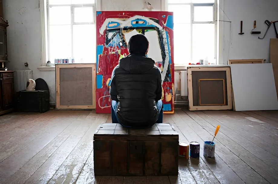
For years, beige, cream, white, and soft gray have dominated interior design. Their appeal is easy to understand. Neutral walls create a calm backdrop, make rooms feel spacious, and allow furniture to take center stage. But in 2026, interiors are becoming warmer, richer, and more personal.
This season’s fall colors are moving beyond the predictable pumpkin-and-brown combination. Designers are turning to chocolate, cinnamon, oxblood, ochre, deep green, navy, dusty pink, and other nuanced shades that give rooms more depth and character. Recent design reports also point to a growing preference for warmer wood tones, layered materials, and interiors that feel collected rather than perfectly coordinated.
That shift is creating an exciting opportunity for art.
Instead of treating artwork as something added after the furniture and accessories are chosen, homeowners can use it as one of the elements that defines a room’s atmosphere. A richly colored painting, expressive abstract work, or carefully chosen photograph can bring an entirely different dimension to seasonal interiors.

Why Fall Is the Perfect Season for Color
Fall naturally changes the way we experience our homes. As daylight becomes shorter, interiors become more important as places for gathering, relaxing, reading, and spending evenings.
That change is reflected in current fall decor trends. Designers are embracing warmer palettes, tactile materials, atmospheric lighting, and rooms with a more lived-in quality. ELLE DECOR’s 2026 trend report highlights darker wood, reflective surfaces, contrasting materials, and a move away from the blank-slate look. Houzz similarly reports that warm wood, earthy colors, layered textures, and natural materials are becoming foundational elements of contemporary interiors.
Color can help create that sense of warmth, but it does not necessarily require repainting an entire room.
Art can introduce a concentrated dose of color without changing the architecture of a space.
A painting with burnt orange details can warm up a neutral living room. A work featuring deep blue can create contrast against warm wood. An abstract composition filled with ochre, burgundy, and muted green can bring several elements of a room together.
The result can feel seasonal without looking like temporary seasonal decoration.
The New Fall Palette Goes Beyond Pumpkin Orange
Traditional autumn palettes often rely on rust, orange, mustard, and brown. Those colors remain relevant, but 2026 design coverage suggests a broader interpretation of the season.
Chocolate brown is emerging as a particularly versatile choice. Homes & Gardens describes it as a grounding neutral that can be paired with cream, pale blue, ochre, green, timber, and brass.
Cinnamon is another important direction. Current fall trend reports describe cinnamon, caramel, tobacco, and rich ochre as warm shades that can create an enveloping atmosphere without making a room feel excessively dark.
Deep greens and blues offer another way to approach autumn. Rather than reproducing the colors of fallen leaves, these shades can capture the mood of the season while giving interiors a more contemporary appearance.
Then there are unexpected choices such as dusty pink, aubergine, tomato red, and even combinations of blue with brown. Current color coverage suggests that designers are increasingly interested in depth and personality rather than following one fixed autumn palette.
For art collectors, that variety matters.
It means autumn-inspired artwork does not have to feature leaves, landscapes, pumpkins, or other obvious seasonal imagery. Color itself can create the connection.
Let Artwork Do More Than Fill a Blank Wall
A common approach to decorating is to choose furniture first and then find something to put on an empty wall.
Art can work differently.
A strong artwork can become the starting point for a room’s palette. Pick a painting that contains a shade you already love, then repeat small elements of that color through cushions, rugs, ceramics, books, or other objects.
For example, imagine a mostly neutral room with walnut furniture. A painting containing burnt orange, muted pink, and deep green could introduce warmth while connecting naturally with the wood. Alternatively, a predominantly blue artwork could provide a cooler counterpoint to brown and ochre furnishings.
This approach makes autumn decor feel more integrated. Instead of filling a room with seasonal objects, the artwork becomes part of the room’s visual identity.
It also gives the space something that mass-produced decorative pieces often cannot provide: a sense of individuality.
From Beige Walls to More Expressive Interiors
The move away from beige does not necessarily mean abandoning neutrals completely.
In fact, neutral interiors can make colorful artwork particularly effective.
A cream or warm-white wall can provide breathing room around a vibrant painting. A soft beige sofa can allow a saturated red or green artwork to become the focal point. Even a gray room can be transformed by a carefully selected piece with warm, earthy tones.
The difference is that the neutral background no longer has to be the entire story.
Current interior trends increasingly emphasize personal collections, patina, unusual combinations, and objects that have a sense of history. ELLE DECOR notes a growing interest in personalized, lived-in interiors, while Houzz reports a shift toward rooms that feel thoughtfully assembled over time rather than universally styled for broad appeal.
Original art fits naturally into that shift.
A painting can carry an artist’s perspective, technique, and visual language into a home. A photograph can introduce a particular place or moment. A mixed-media work can add texture that echoes materials elsewhere in the room.
How to Choose Art Around Fall Colors
You do not need to match your artwork exactly to your walls or furniture.
Instead, look for relationships between colors.
If your room features chocolate brown, consider artwork containing cream, pale blue, olive, rust, or ochre. For a room built around deep green, look for complementary warm tones such as terracotta, pink, gold, or red.
A navy interior can work beautifully with artwork containing warm orange or muted yellow. A room with cinnamon or caramel tones can accommodate deep blue, burgundy, green, or even lavender accents.
Another option is contrast.
A predominantly warm room does not need warm artwork. A cool-toned painting can become the visual interruption that makes the surrounding colors more noticeable.
The goal is not perfect coordination. It is visual conversation.
Why Art Is Becoming More Important in Seasonal Interiors
Unlike cushions or tabletop decorations, artwork does not have to be replaced when the season changes.
That makes it particularly useful for people who want to bring the feeling of fall decor into their homes without creating a temporary theme.
A landscape with autumnal tones can remain on the wall throughout the year. An abstract painting containing rust and ochre can work just as well in winter or spring. A photograph featuring warm architectural tones can complement changing accessories without becoming outdated.
This is also where the idea of buy art becomes more interesting than simply shopping for seasonal decorations.
Buying an artwork is not just about filling a space. It can be about finding something that continues to have meaning after a particular trend disappears.
The best seasonal interiors do not necessarily look seasonal. They feel warm, inviting, layered, and personal.
Bring the Season In Through Art
The return of richer color does not mean every room needs a dramatic makeover.
Sometimes one artwork is enough.
A large abstract painting can introduce an entirely new color story. A small work can add a concentrated accent to a shelf or reading corner. A series of photographs can bring visual continuity to a hallway. A colorful contemporary piece can turn an otherwise restrained room into something much more expressive.
The latest fall colors are giving interiors permission to become less predictable. Chocolate, cinnamon, ochre, deep green, navy, burgundy, and unexpected pinks are replacing the idea that seasonal design has to follow one familiar formula.
And that makes this an ideal season to rethink the role of art at home.
Rather than asking what decoration will make a room look like autumn, consider what artwork can make the room feel richer, warmer, and more like your own.
Because when color returns to interiors, art has a lot more room to speak.