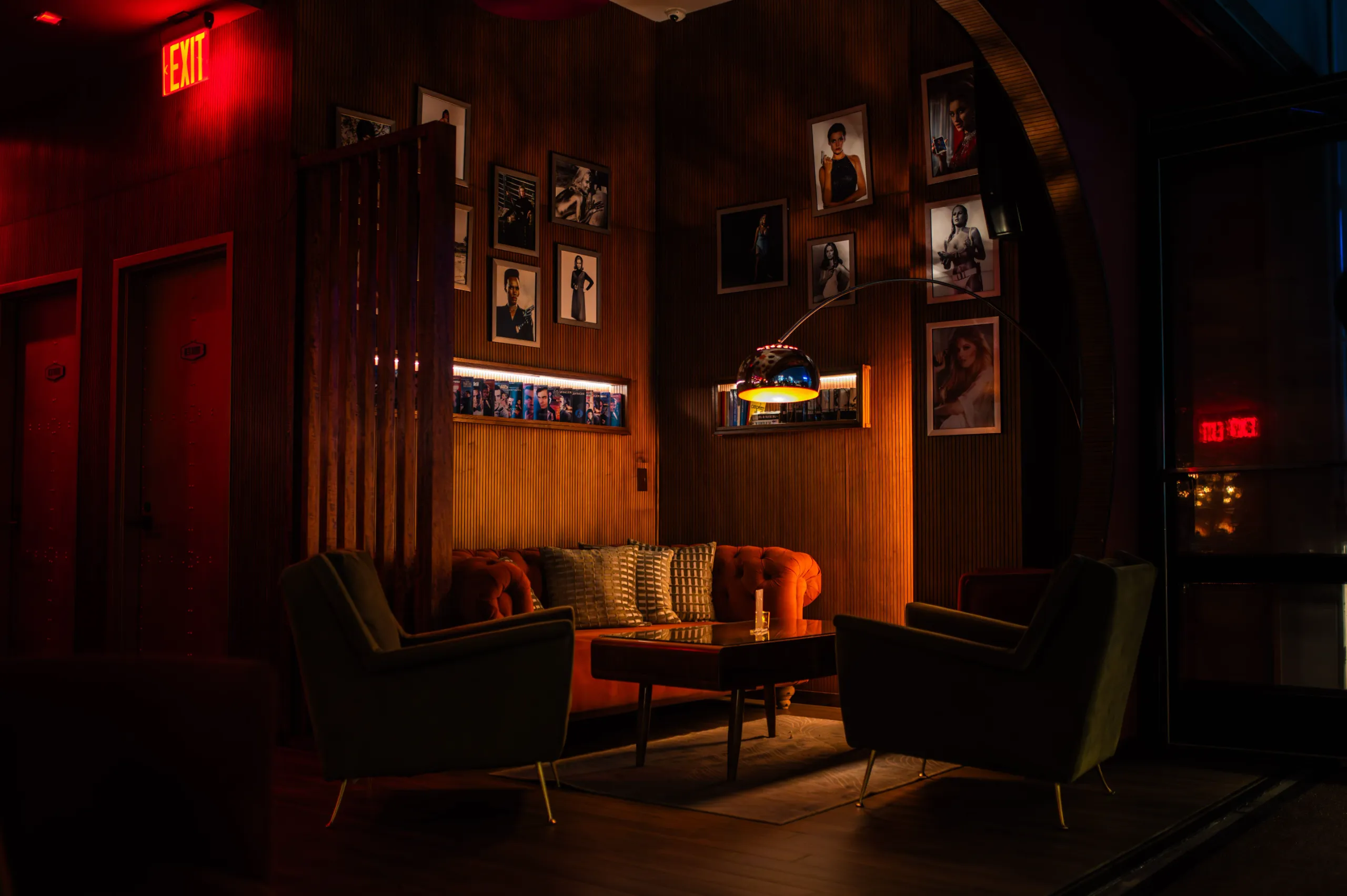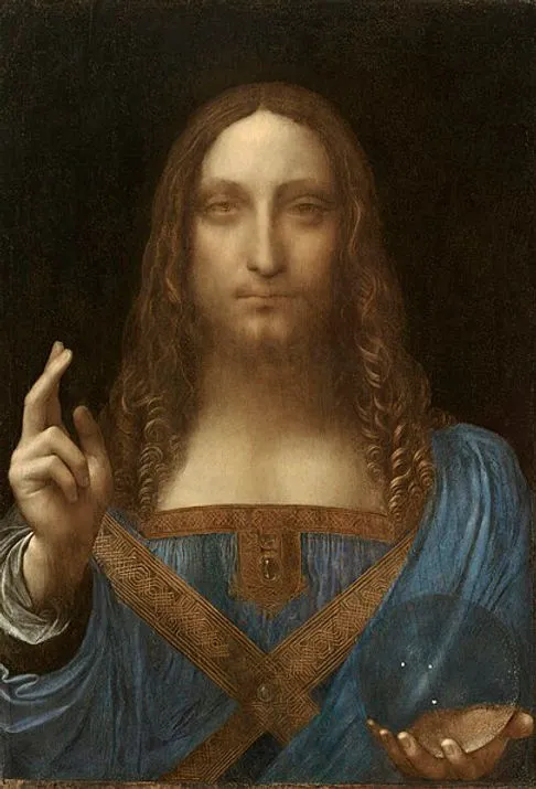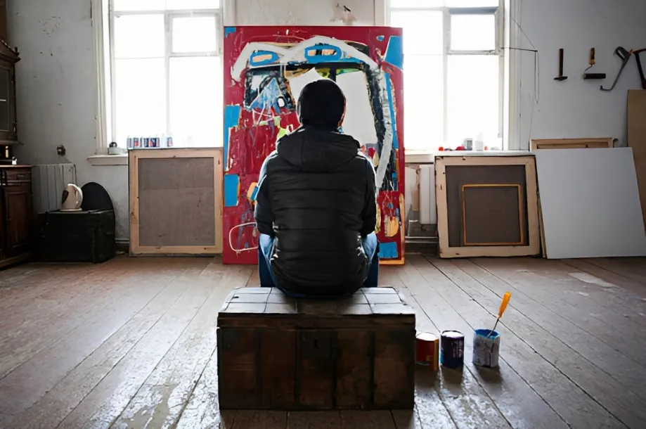
A moody room is always so atmospheric. The right piece of artwork, textured fabrics, low lighting and dark wood, and deep walls can transform a basic room into an intimate, refined and vital space all on their own.
However, it is not just a matter of making everything darker. Balance is a key principle in interior design, whether it’s the contrast of a cool blue wall against a warm wood floor, or a bold piece of furniture in a room that’s otherwise sparsely furnished. This is the same for art.
If your room is leaning towards one of the charcoal, forest green, midnight blue, burgundy or chocolate brown tones, the perfect artwork can either reinforce these or add just enough contrast that the room needs. Even contemporary interior design advice has a focus on rich colors, various layers of fabric, and intentional contrast, but no matter how much a space is covered in black.
So, which art colors work particularly well in a moody space?
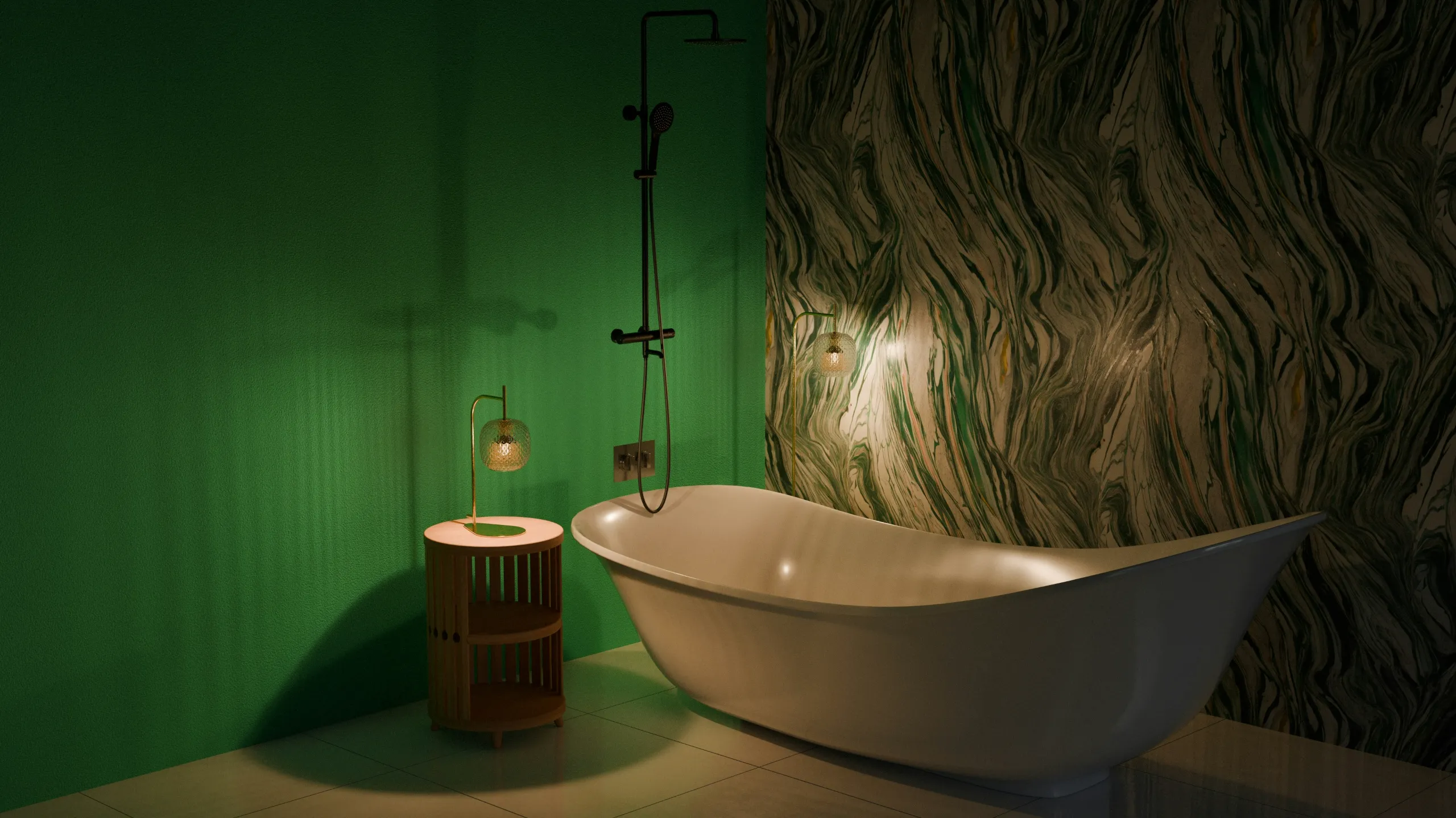
1. Emerald Green for Richness
One of the colors that are easiest to add to a dramatic room is deep green, as it has a lot of depth inherent but does not feel as dark as black.
Emerald, moss, forest or olive green can be a great color to pair with charcoal walls, dark wood or warm neutral furniture. It can also bridge from an interior to the natural world, especially when used in conjunction with botanical imagery, landscapes or organic forms.

If the room itself has a few dark pieces, consider art with green and cream, beige or muted gold. The minimal amount of light can ensure that the composition does not fade into the background.
Another aspect of green in interior design is that it can be used in various room styles ranging from classic studies to modern living rooms.
2. Deep Burgundy for Warm Drama

If your idea of a moody interior design is more romantic than minimalist, burgundy is worth considering.
A dark color palette can be complemented by deep red, wine and oxblood shades. They are particularly useful in works of art with florals, portraits, abstract shapes or expressive compositions.
Experiment with a burgundy piece of art against charcoal walls, espresso brown walls or muted beige walls. It doesn’t have to be a stark contrast. A painting using several different hues of red, in addition to black and brown, can look together more than brightly colored painting.
In interior design burgundy works well with other materials that are typically used in atmospheric interiors such as velvet, aged wood, leather and brass.
3. Midnight Blue for a Cooler Mood
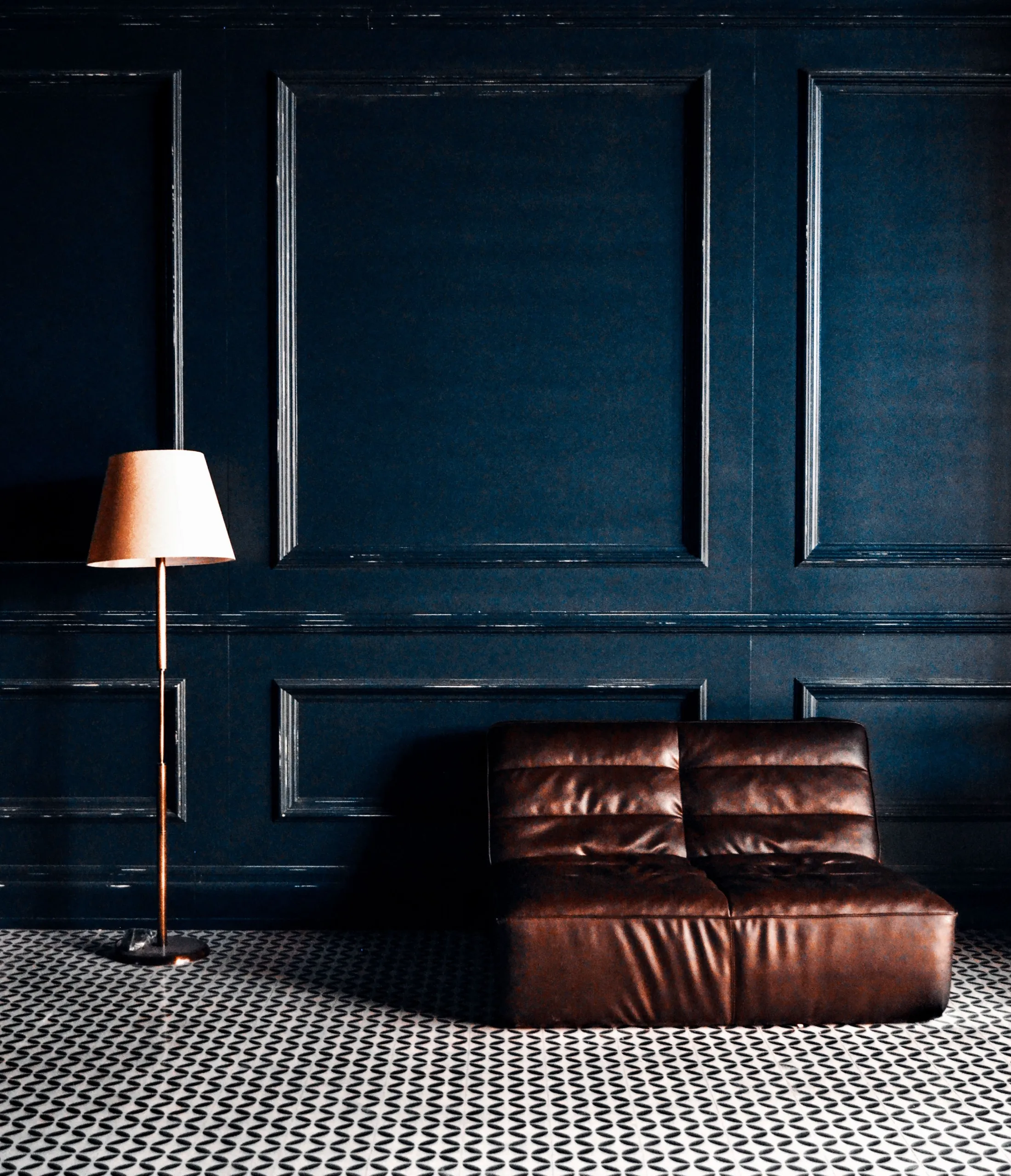
For something dramatic without feeling overly warm, look toward deep blue.
Midnight blue, navy, indigo and blue-black colors can add a mysterious element to an artwork while still invoking a sense of calm. These shades are ideal for bedrooms, studies and reading spaces where you might prefer the room to feel more cozy as opposed to lively.
This can be a monochromatic effect, depending on the colour of the artwork and the wall, or a lighter blue or ivory detail can be added to make the artwork stand out.
Dark blue is also an excellent color to coordinate with wood. Dark blue and medium tones of wood are often combined in interior design to avoid a cold palette.
4. Plum and Aubergine for Something Unexpected
Though purple can be a bit confusing in the interior design world, its more profound color variations can be quite sophisticated.
If you want something bright violet, you might want to go for plum, aubergine, mulberry or dusty purple. These shades can lend personality to a dark room.
For vintage, maximalist or gothic interior furnishings they are especially interesting. Use with charcoal walls and antique gold for a plum heavy piece or with deep green for a more textured appearance.
Patience is the key. A single purple piece of art can be a punctuation mark, but won’t fill a room with a purple theme.

5. Cream and Ivory for Contrast
Not every artwork for a moody interior design needs to be dark.
In some cases, light pieces of art may make a great statement in relation to dark walls. It is important to note that, dark backgrounds can help works of art stand out, specially if the artwork’s background is mostly white.
Consider ivory, parchment, warm white and soft cream instead of clinical white.
The light artwork can be the center of the dark living room or bedroom. This method is great for portraits, minimalist compositions, line drawings and abstract works.
The contrast with dark furniture in the surrounding room can make the artwork seem to be lit up.

6. Antique Gold for a Gilded Touch
Gold does not have to dominate an artwork to make an impression.
In dark rooms, small accents of antique gold, ochre or dull metal finishes might give warmth. This is especially effective if the room already has brass lighting, gold framed mirrors or warm wood.
The key difference between antique gold and reflective metallic gold is their reflective properties. A toned down gold feature will blend in with the dark coloration of an interior space rather than look overly shiny.
You can match a painting — such as a dark green, burgundy, brown and soft gold room — that will tie in rooms to other rooms without necessarily matching it exactly.

7. Terracotta and Rust for Earthy Depth
Want your moody room to feel warmer and more grounded?
Look for artwork containing terracotta, rust, burnt orange or clay tones.
These colors are particularly nice to go with chocolate brown, olive green, charcoal and natural wood. They can also help to break up the visual flatness of a dark room.
The more recent interior design debates on the use of deeper earth colors have also given particular emphasis to colors like rust, paprika, terracotta and cinnamon, as means of giving warmth and depth.
These shades can be used effectively for artwork in landscape, abstract paintings and still-life scenes.
What About Gothic Home Decor?
A moody interior does not automatically have to become gothic home decor.
However, if you love gothic-inspired spaces, artwork can help establish that atmosphere without relying on stereotypical decorations.
Charcoal, black, burgundy, forest green, deep purple, midnight blue and antique gold are all themes that fit within a Gothic room. The design guides that have emerged recently also make it clear that gothic interiors are more than just black walls, as other elements of the design, like texture, ornament, aged materials, lighting, and artwork, also play a major role in creating the atmosphere.
This is where artwork can be of added benefit. You don’t have to clutter up a room with obvious ‘gothic’ items, one powerful painting, portrait or photograph can set the tone.

Let the Artwork Create the Contrast
The biggest mistake when decorating a moody room is assuming that everything needs to match.
It doesn’t.
You don’t have to use green pictures for artwork if your wall is dark green. A black and white picture could be an important center of interest. Navy is a dark color, and burgundy could add warmth to the room if it is mostly navy. If there are a lot of designs on the furniture, a simpler monochromatic work may provide a point of focus for the viewer.
Dark color schemes seem to be emphasized in interior design in terms of contrast and balance. The objective is not simply to accumulate dark colors, but to create a layered space in which different elements can be seen and appreciated.
As with any artwork, regard it as part of the visual conversation in the room, not a decorative article. Think of your artwork as part of the room’s visual conversation rather than another decorative object.
The Right Artwork Can Change the Entire Room’s Interior Design
A moody room design does not need to feel gloomy, and dramatic does not have to mean overwhelming.
Deep green can bring nature into the space. Burgundy can add warmth. Midnight blue can create calm. Plum can introduce mystery. Ivory can provide contrast, while gold and terracotta can add warmth.
The best choice depends on the atmosphere you want to create.
Start by looking at the dominant colors already present in your room. Then decide whether your artwork should blend, contrast or bridge the two. A well-chosen piece can connect the walls, furniture, lighting and textures while still demanding attention of its own.
That is where art becomes more than decoration. In a carefully considered interior, it can be the element that gives the entire space its mood.
For a marketplace built around discovering original artwork, that makes color more than a design detail. It becomes one of the ways a painting finds its place in a home.