
For the Austen fans, there’s been an announcement: the new film adaptation of Sense and Sensibility, directed by Georgia Oakley, is coming to theaters on October 16, 2026, in the US— and it’s right in the middle of an Austen Renaissance! Between this, Netflix’s new TV series adaptation of Pride and Prejudice and “regencycore” sweeping the “old money aesthetic” TikTok moment, corsets, candlelit drawing rooms, and quiet, aching restraints are back in the cultural spotlight.
However, most fans of period dramas don’t know that the world you are enamored with on the screen already has a name in art history. This is called the Neoclassical art style, and this style was the one that was very popular in the decades in which Jane Austen was writing. If the subdued hues, interior architecture, and composed, dignified figures of Sense and Sensibility are to your taste, then you already have a taste for one of the most important art movements of 18th-century art!
Why Austen and Neoclassicism Are the Same Story, Told Twice
Sense and Sensibility, by Jane Austen, was published in 1811, in the middle of the Neoclassical era, which was from about the 1760s to the 1830s. It was not chance, however, but a common worldview that brought it about. This 18th-century art is a direct response to the excess of Rococo art with its frivolous pastels and gilded decoration and embraces order, restraint, clarity, and moral seriousness. Sound familiar? That is, the emotional structure of the entire novel: Marianne’s sensibility versus Elinor’s sense, reason against feeling.
Neoclassical artists were returning to the classical world of Greek and Roman art for both the subjects and the ideals; they were influenced by the newly unearthed ruins of Pompeii and the declarations of classical art’s greatness by writers such as Johann Winckelmann. It was a style of lines, balance, and a certain visual self-restraint; figures were contained, even at their most dramatic moments. This is the same as in a Regency drawing room, where a raised eyebrow speaks as loud as a shout.
Neoclassical-Inspired Artwork Examples

The central figure of the movement, Jacques-Louis David, is the first person to begin with, as the classicist paintings are enjoyed for their simplicity, their overall sense of harmony, and their focus on virtue. The image people typically have of Neoclassicism is of his 1784 masterpiece, Oath of the Horatii, three brothers stretching their hands out and giving one another their oaths without feeling, while their father gives them swords to symbolize their duty to the state. It is essentially Austen’s ‘sense over sensibility’ theme, a whole generation before she wrote it down… in oil paint.

The other must-see is David’s Death of Socrates, Socrates standing tall and stoic, reaching for the cup of poison he is condemned to drink, while his followers gather in tears around him. Another Neoclassical fascination with controlling oneself in the face of it all, feeling it all, and showing very little.
Jump forward a generation, and you are on Jean-Auguste-Dominique Ingres, the most famous pupil of David, who used precision in portraits to a degree that was almost as refined and controlled as porcelain skin, clean lines, and sitters who looked carved rather than painted. A lot of Neoclassicism tips its hat to Romanticism in Ingres, but it’s still the same DNA.
Read More: Romanticism vs Neoclassicism: How Opposing Trends Created Masterpieces
Angelica Kauffman: The Woman Who Might Have Painted Austen’s World

A leading Neoclassical painter and a founding member of the Royal Academy, Angelica Kauffman was a woman whose story is the type that even most pop-history round-ups would be hard-pressed to tell you more. Born in Switzerland, Angelica Kauffman was one of just two women founding members of London’s Royal Academy of Arts in 1768, a very radical step in a profession almost entirely closed to women. She created a career based on the depiction of mythological or historical scenes, with all the elegance and emotional intelligence that Neoclassicism adored, and rose to fame as a working woman artist in a world that actively intended to keep her out. It is its own quiet act of “sense” triumphing over a world consumed by propriety.
You might have actually spotted her work and not even known it. In Ang Lee’s 1995 Sense and Sensibility, the film’s scenes set in the house of Norland are set in an actual Angelica Kauffman painting, since it was filmed at Saltram House, the home of her early patrons, the Parker family. She exhibited Hector Taking Leave of Andromache among them at the first Royal Academy exhibition in 1769. It is a scene of a warrior leaving his grieving wife and a quiet reminder of the lost and displaced fate of the Dashwood women at the beginning of the story. Perhaps it was on purpose, perhaps it was just a bonus to their filming of the famous home, but it’s an ideal little Easter egg for Austen enthusiasts.
Had Austen painted rather than written, one might argue that she would have painted like Kauffman: composed, clever, emotional, and quietly rebellious towards a man’s realm of control.

From the Screen to Your Walls
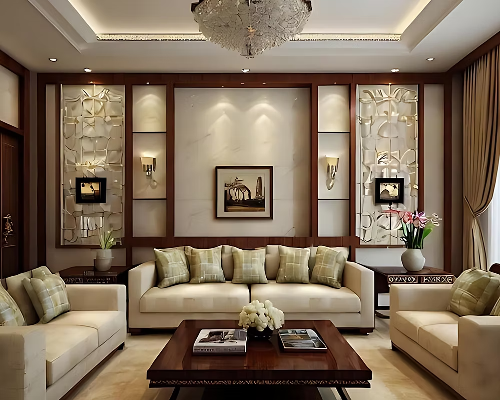
Perhaps this is the reason that everyone likes period drama movies—it’s not so much about the twists in the story. It’s all about the world, the architecture, the calm, the intentional design in every room. It’s precisely why the Neoclassical-inspired art is the natural conclusion for fans of the look and feel of Austen adaptations. It is the same language of the image—order, elegance, quiet drama—only this time it’s on a wall and not on a screen.
If you’re now seeing classical, composed art in a new light, then TERAVARNA’s marketplace is chock full of contemporary pieces that take the same mythological, larger-than-life subject matter that the Neoclassical painters adored but interpret it through a different lens. A few neoclassical artists and their work worth a look:
“Aphrodite Rises from the Sea” (ink) by Michael Aakhus, inspired by the same mythology, is a work of personal interpretation of Aphrodite, the Greek goddess of love and beauty.

“Persephone,” by Kathleen Fietz, is a large-scale acrylic rendition of the goddess of spring, which would feel just as at home next to a David or an Ingres.
Find other pieces in the full collection of mythology in the marketplace to convey the same timeless sense of balance, elegance, and quiet drama—the kind of art that would make Elinor Dashwood feel at home. It’s a great place to start whether you’re creating a “regencycore” area in your apartment or simply need a piece that has presence over the mantel.
So when you’re in the throes of a candlelit ballroom scene, you know you’re not just a period drama enthusiast. You have a neoclassical sense of design. You might as well start collecting like one.